Best Web Design Practices for Converting Video Ad Traffic
By SendBridge Team · Published May 05, 2026 · 8 min read · Marketing
Video marketing has completely reshaped how brands interact with consumers online. Whether scrolling through TikTok, watching YouTube, or browsing Instagram Reels, users are constantly exposed to dynamic, high-quality video content. Brands spend significant portions of their marketing budgets scripting, filming, and editing these campaigns to capture attention in an incredibly crowded digital ecosystem. However, a glaring disconnect often occurs the moment a user actually clicks the call to action.
Getting a prospect to click on a video advertisement is only half the battle. The true measure of a campaign's success is determined by what happens next. If a user transitions from a highly engaging, fast-paced video into a clunky, confusing, or slow-loading website, that hard-earned click is immediately wasted. To maximise the return on investment for paid media, businesses must ensure their web design principles are perfectly aligned with the expectations set by their video creatives.
The Psychology of the Post-Click Experience
When a user clicks on a video ad, they are transitioning from a passive viewer to an active participant. On platforms like TikTok or Instagram, scrolling is an involuntary, almost hypnotic action. Breaking a user out of that scroll requires a compelling hook. Once they make the conscious decision to click your ad, their mindset shifts entirely. This shift in behaviour requires a seamless digital environment to maintain their momentum. Users have just been visually stimulated and emotionally engaged. They expect the subsequent landing page to deliver on the exact promises made in the video, without requiring them to hunt for information.
This is where strategic partnerships and holistic digital planning become crucial. For example, when a company collaborates with a specialised video ads agency to capture high-intent audiences, they are essentially buying highly qualified top-of-funnel traffic. The agency works to refine the targeting, perfect the hook, and drive the right people to the website. But once that traffic arrives, the responsibility shifts entirely to the website's user experience. If the web design lacks clear direction or fails to highlight the specific product featured in the ad, the user will experience cognitive friction and bounce.
Every extra second a user spends trying to figure out where they are supposed to click is a second where they are likely to reconsider their purchase. The design must do the heavy lifting by guiding the user effortlessly from the initial point of entry all the way through to the final conversion. An optimized post-click experience feels less like a sales pitch and more like a helpful continuation of the story that the video began.
The Importance of Visual and Verbal Continuity
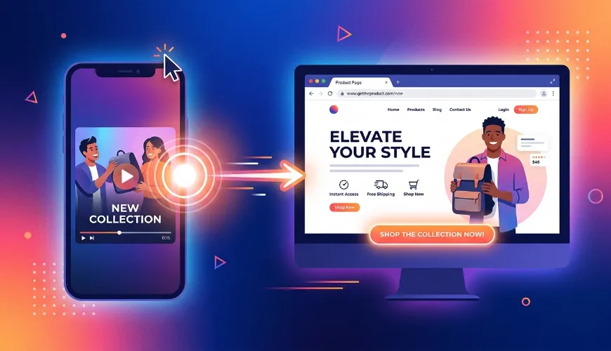
One of the most frequent mistakes in post-click web design is failing to maintain visual and verbal continuity between the ad and the landing page. If a video ad features a specific spokesperson, a vibrant colour palette, and a clear promotional offer, those exact elements need to be the very first things the user sees when the page loads. The aesthetic jump from the ad platform to your website should feel virtually invisible.
This concept is widely known in the digital marketing industry as message match. Maintaining a strong message match increases conversions because it reassures people they have come to the right place. As landing page experts often point out, failing to align your ad copy with your landing page content is essentially disrespecting the user's click. If a video ad promises a free trial for a software tool, but the landing page primarily talks about enterprise pricing, trust is instantly broken.
To design for continuity, web developers and marketers must work closely together. The headline of the landing page should mirror the core hook of the video verbatim. For instance, if an e-commerce video ad highlights "sustainable running shoes," the landing page header should prominently display those exact words rather than a generic brand slogan. The typography, imagery, and overall aesthetic tone must feel like a natural extension of the campaign. By mirroring these elements, the web design eliminates confusion and reinforces the purchasing intent that the video ad initially sparked.
Building a Rock-Solid Technical Foundation
While aesthetics and messaging are incredibly important, they are entirely useless if the website does not load fast enough for the user to see them. Video ads are inherently fast-paced, and modern consumers have zero patience for lagging websites. If an incoming visitor has to wait more than a couple of seconds for a page to render, they will simply hit the back button.
This performance factor is why good web design is inseparable from strong technical infrastructure. In fact, research demonstrates that the impact of page speed on ad conversion rates is profound, with one-second load times generating up to three times the sales of significantly slower pages. Technical improvements like compressing large image files, utilising content delivery networks, and minifying code are no longer just search engine optimisation tactics. They are fundamental conversion rate optimisation strategies. Paying close attention to metrics like Core Web Vitals, specifically Largest Contentful Paint and Cumulative Layout Shift, ensures that your pages not only load quickly but remain visually stable as the user interacts with them.
To maintain this level of performance as a website grows, ongoing technical maintenance is required. Investing in scalable SEO solutions, such as optimising database queries and refining overall site architecture, is essential to keep paid traffic engaged before they abandon the site. When your technical foundation can handle spikes in traffic without lagging, your return on ad spend naturally improves.
Furthermore, slow load times do not just hurt your immediate sales. Advertising platforms like Google and Meta heavily penalise advertisers whose landing pages provide a poor user experience. High bounce rates signal to these platforms that your website is not relevant or functional, which subsequently drives up your cost per click. By designing lightweight, technically sound landing pages, you are directly improving the financial efficiency of your video ad campaigns.
Key Design Elements to Maximise Ad Conversions
To truly capitalise on incoming video traffic, your landing pages need to be engineered specifically for conversion. General homepages rarely work well for this purpose because they are designed to cater to a variety of different user intents. Instead, dedicated landing pages should be utilised for every distinct video campaign.
When constructing these dedicated environments, several specific design practices should be implemented to ensure the highest possible conversion rates:
| # | Principle | Description |
|---|---|---|
| 1 | Minimise Navigational Distractions | When a user arrives from a video ad, they should only have two options: convert or leave. Removing standard website navigation bars, footer links, and distracting sidebar widgets forces the user to focus entirely on the primary call to action. |
| 2 | Prioritise Above-The-Fold Clarity | The most critical information must be visible immediately without requiring the user to scroll. This includes a headline that matches the ad, a brief subheadline explaining the value proposition, and a highly visible button. |
| 3 | Design for the Mobile Thumb Zone | The vast majority of video ad clicks occur on mobile devices. Web designers must prioritise the mobile experience by placing interactive elements, like buttons and form fields, within easy reach of the user's thumb. |
| 4 | Implement Directional Cues | Visual hierarchy plays a massive role in user behaviour. Designers should use explicit directional cues like arrows, or implicit cues like the eyeline of a person in a hero image, to guide the visitor's attention directly toward the conversion point. |
| 5 | Create Frictionless Forms | If your video ad is designed to generate leads, the corresponding form must be as simple as possible. Multi-step forms with progress bars often perform better than long, intimidating single-page forms. Only ask for information absolutely necessary to move the prospect to the next stage. |
| 6 | Incorporate Social Proof | Users arriving from an ad might be interacting with your brand for the very first time. Including trust signals like customer reviews, partner logos, or security badges directly below the main content area helps alleviate anxiety and builds immediate credibility. |
Testing and Iteration for Long-Term Success
The final piece of the web design puzzle is acknowledging that a landing page is never truly finished. Consumer behaviour is constantly shifting, and what works for one video campaign might not work for the next. The best digital strategies rely heavily on continuous testing and refinement to squeeze the most value out of every advertising dollar.
A/B testing different design elements allows you to make data-driven decisions rather than relying on gut feelings. You might find that a video background header slows down the page too much and hurts conversions, or you might discover that changing the colour of your call to action button yields a massive increase in leads. Implementing tools like heatmaps and session recordings can also provide invaluable insights into exactly where users are experiencing friction. By systematically testing headlines, imagery, form lengths, and technical configurations, you can incrementally improve the performance of your post-click experience.
Ultimately, generating traffic through compelling video content is a fantastic way to grow a business, but it is only the beginning of the customer journey. By combining high-impact advertising with thoughtful, user-centric web design, brands can ensure that every click has the highest possible chance of turning into a meaningful and profitable relationship. Focus on continuity, prioritise technical speed, and remove all unnecessary friction. When the web design supports the advertising rather than hindering it, the results will speak for themselves.