How Manufacturing Dashboards Close the Gap Between Data and Decision-Making
By SendBridge Team · Published Mar 19, 2026 · 7 min read · Technology
Manufacturing floors generate enormous amounts of data every shift. Machine output, defect rates, cycle times, equipment downtime: it's all there. The problem most operations run into isn't a shortage of data. It's that the data sits in systems that don't talk to each other, reports that take hours to compile, and spreadsheets that are outdated by the time they reach a manager's desk.
A manufacturing dashboard changes that relationship. Instead of chasing numbers after the fact, production teams can see what's happening now on a screen mounted at the line, in a meeting room, or on a shared monitor in the operations center. The goal is simple: make the right information visible to the right people at the right time - a principle that also underpins effective digital marketing for manufacturers, where timely insights drive better decision-making and performance.
That's where real-time dashboards earn their place in a modern facility. Many manufacturing dashboard platforms allow teams to display live KPI feeds across shared screens throughout a plant, so operators, supervisors, and managers are all working from the same picture without needing to log into a reporting tool or wait for a morning standup. Connecting operational data to the screens where decisions actually get made is the whole idea.
What a Manufacturing Dashboard Actually Does
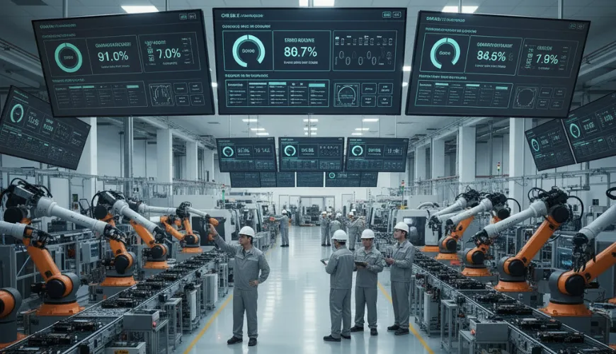
A dashboard in this context isn't a static chart in a PowerPoint deck. It's a live interface that pulls data from machines, sensors, ERP systems, and other operational sources and presents it in a format people can act on quickly.
Common metrics include Overall Equipment Effectiveness (OEE), which combines availability, performance, and quality into a single measure of how well machines are running. You'll also typically see throughput, defect rate, cycle time, and planned versus actual production counts. Some facilities add maintenance indicators, like mean time between failures (MTBF), to give the maintenance team a heads-up before a breakdown happens rather than after.
The most useful dashboards are built around one guiding question: what will this person do differently when they see this number? That keeps the display focused rather than overwhelming operators with data they can't act on. According to NIST's Advanced Manufacturing Data Infrastructure and Analytics program, manufacturers need trusted, understandable data workflows to support better decision-making across operations and supply chains, and visibility at the point of work is a core part of that foundation.
The Information Delay Problem on the Shop Floor
One of the most persistent challenges in manufacturing operations is the delay between when something goes wrong and when someone with the authority to fix it finds out. A machine starts underperforming at 6 AM. By the time a supervisor reviews the shift report, it's 9 AM. Three hours of lost throughput and a quality issue that may have already affected an entire batch.
Visible, real-time production data shortens that window significantly. When performance metrics are displayed at the line level, operators notice anomalies immediately. When the same data feeds a screen in the operations office, supervisors can respond without waiting for someone to walk over and explain what happened.
This is especially relevant as the manufacturing sector faces mounting pressure on staffing and retention. According to Deloitte's research with the Manufacturing Institute, attracting and retaining talent remains the primary business challenge for over 65% of U.S. manufacturers, which means operations increasingly depend on getting maximum output from the teams they have. Reducing friction in how information flows across a facility is one lever that doesn't require adding headcount.
Getting the Right Metrics in Front of the Right People
Not every metric belongs on every screen. An operator running a single production line doesn't need the company's quarterly cost-of-goods numbers. A plant manager doesn't need individual spindle data unless something is flagged. The mistake many facilities make when rolling out a dashboard system is treating it like a single scoreboard for everyone.
A better approach is to think in layers:
Line level: Cycle time, output count, defect flags, and machine status. The people here need to know if something is off and needs attention right now.
Supervisor level: Shift totals versus targets, OEE by line or work cell, any active maintenance alerts. This view supports decisions about resource allocation and prioritization during the shift.
Management level: Daily and weekly trends, cost-per-unit, on-time delivery rates, downtime summaries. This is where pattern recognition happens and where production planning discussions start.
When each group sees what's relevant to their work, dashboards become tools people actually use rather than screens they walk past.
Where Displays Fit Into a Broader Communication System
A dashboard on a screen is only as useful as its placement and visibility. In most facilities, this means a combination of mounted displays at the line, shared screens in break rooms or walkways, and larger monitors in supervisory areas or operations centers.
The physical placement matters because it shapes behavior. A display that shows production targets versus actuals, updated continuously, creates natural accountability without anyone having to say a word. Teams can see whether they're on pace. Supervisors can walk the floor and have an informed conversation based on the same data everyone has already seen.
The Manufacturing Institute has noted in its workforce research that employee engagement and communication quality are increasingly tied to retention outcomes, particularly for younger workers who expect transparency about how the operation is performing. Visible production metrics are one practical way to close that gap.
Common Setup Mistakes and How to Avoid Them
A few patterns tend to get in the way of a successful rollout:
Too many KPIs on one screen. Crowded dashboards are hard to read quickly, which defeats the purpose. Most effective setups display five to eight metrics per view, with clear visual hierarchy so the most critical numbers are immediately obvious.
Static or infrequently updated data. A dashboard showing numbers from two hours ago isn't a dashboard; it's a delayed report. If the data connection isn't live, operators won't trust the display, and engagement drops fast.
No alerts for out-of-range conditions. Numbers within the normal range don't require action. When a metric crosses a threshold, the visual treatment should make that unmistakable: color changes, bold indicators, or a separate alert zone.
Lack of alignment between what's displayed and what's actionable. Every metric on the screen should connect to something a person in that role can do. If a number is informational only, it belongs in a report, not a real-time display.
Moving from Visibility to Accountability
There's a cultural component to this that doesn't always get mentioned. When production data is visible to the whole team, the dynamic around performance shifts. Goals aren't abstract. Progress is concrete. Problems don't stay hidden until the end of a shift.
That shift requires some deliberate onboarding. Teams need to understand what each metric means, why it matters, and what a reasonable response looks like when a number goes red. Without that context, a dashboard is just colored lights. With it, it becomes a shared language for how the operation is running.
The practical side of getting dashboards onto screens has become much more manageable over the past few years. Cloud-based platforms that don't require dedicated hardware or IT infrastructure have brought this capability within reach for mid-sized facilities that couldn't have justified it a decade ago. The harder work: deciding what to measure, how to present it, and how to build the habits around acting on it, is where the real investment of time goes.